I’ve long been fascinated by the pin-up calendars from the 1950s and 1960s. For reasons I don’t pretend to understand, they were one of the only socially tolerated — if not exactly socially acceptable — outlets for nude imagery in the US at that time. The most famous calendar girl model, of course, was Marilyn Monroe, who had posed for one of the calendar companies before she became famous.
Here are some examples of calendars from that era:
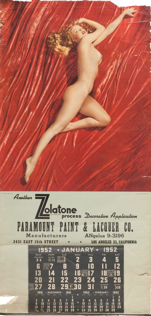
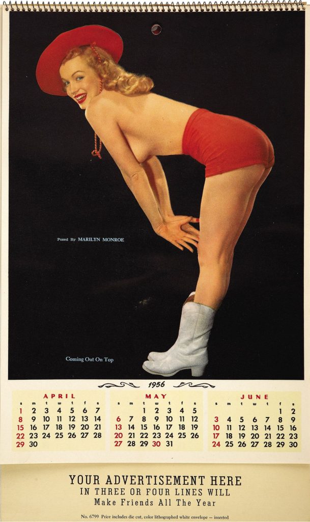
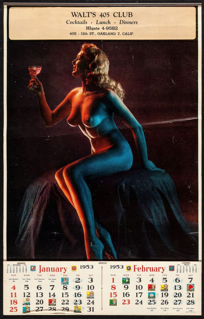
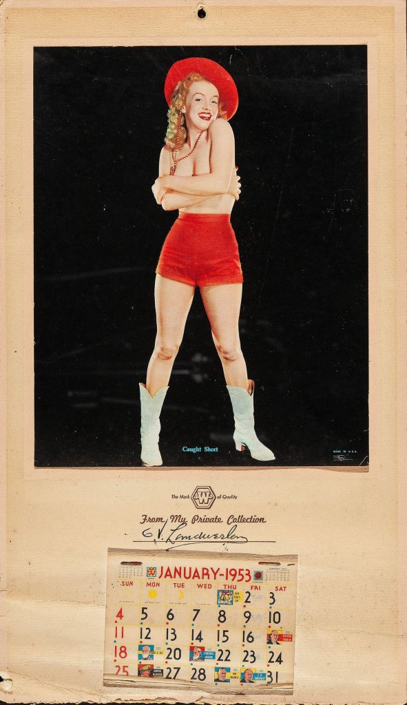
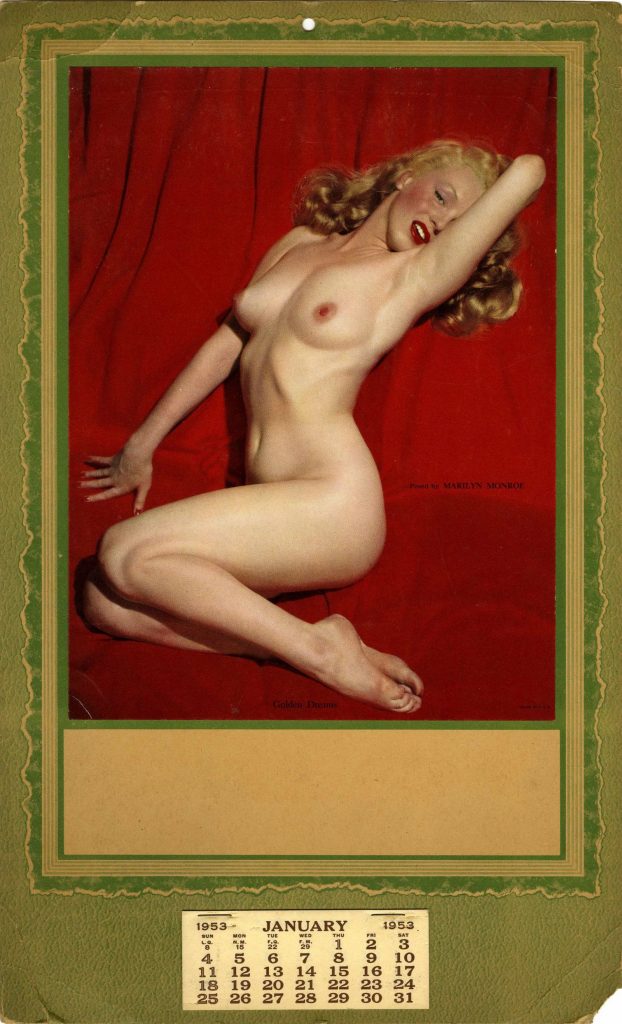
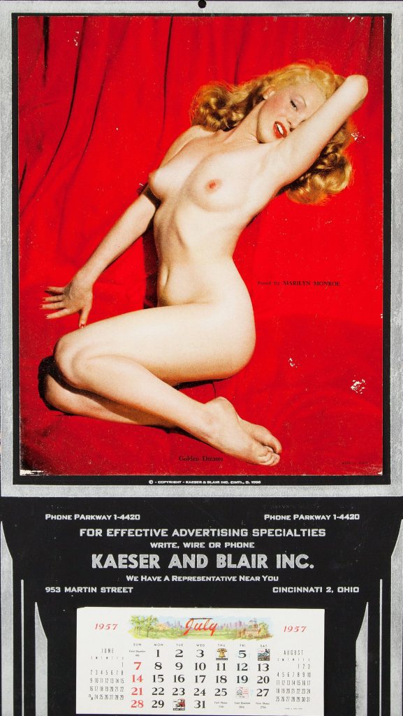
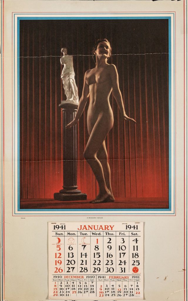
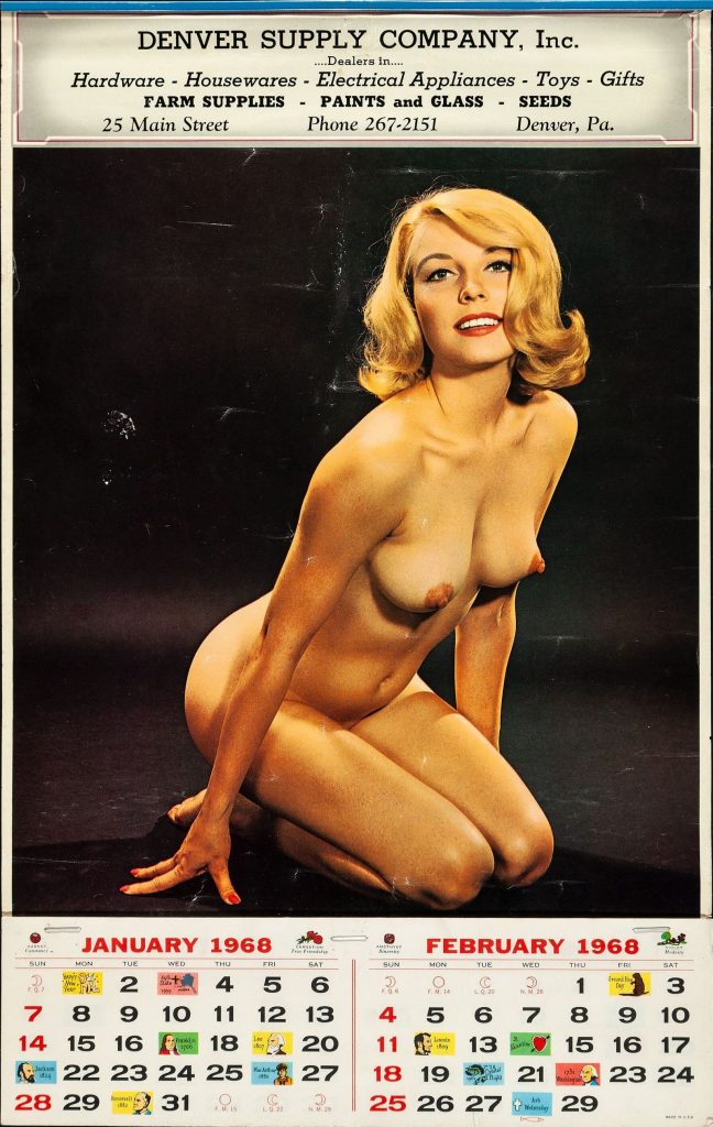
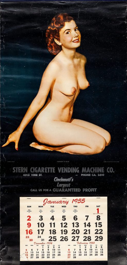
Calendar companies would custom print a company’s name and information on calendars that they could give away as promotional items. Most of the companies had a substantial catalog of images to choose from, with both nude and non-nude images. There were also many styles, but the most popular featured a single image with tear-off calendar sheets at the bottom. The popularity was probably due to the fact that it would have been fairly cheap to produce.
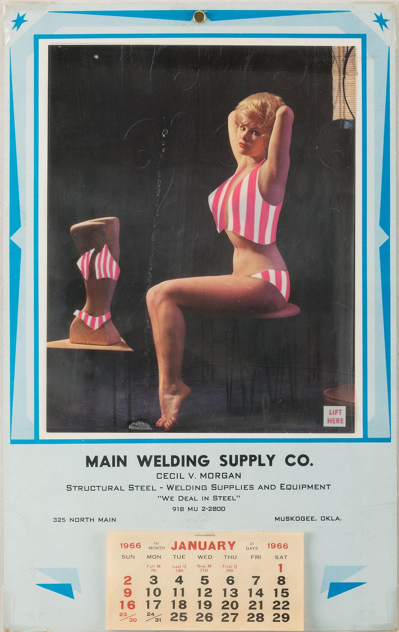
There were even some companies that produced nude calendars that came with an acetate sheet on them with a drawn-on bathing suit that could then be peeled off to reveal the nude image beneath. I assume this was to get around some kind of censorship law or to make the calendars more socially acceptable when delivered. I suppose it could have also added to the percieved naughtiness of the calendar, though.
Recently, I decided it would be fun to do an homage to the calendars from this era. I’m not sure why the idea took me all of a sudden. A week into the new year is really not the ideal time for starting a calendar project, but… once it occurred to me, it just seemed like a good quarantine project.
My original thought was to set up a shoot specifically to create images in the style of some of the old calendars, but almost on accident, I stumbled across a series of photos in my library that already had the right feel:

Other than her tattoos, this shot of Juno could easily be from the 1950s or 1960s. The pose, her haircut, everything felt pretty on the nose with almost a Bunny Yeager feel to it. This was a perfect picture for prototyping the idea and saved me the expense of setting up a new shoot, at least for now.
Designing the Calendar
I didn’t want to exactly mimic any of the existing calendars, but rather create a modern calendar reminiscent of and inspired by those older ones. My main inspirations for the calendar portion were the Walt’s 505 Club and Denver Supply Company, Inc. calendars in the gallery above. I opted not to use the graphics honoring historical figures, though, and stick with just numbers to keep them less cluttered feeling.
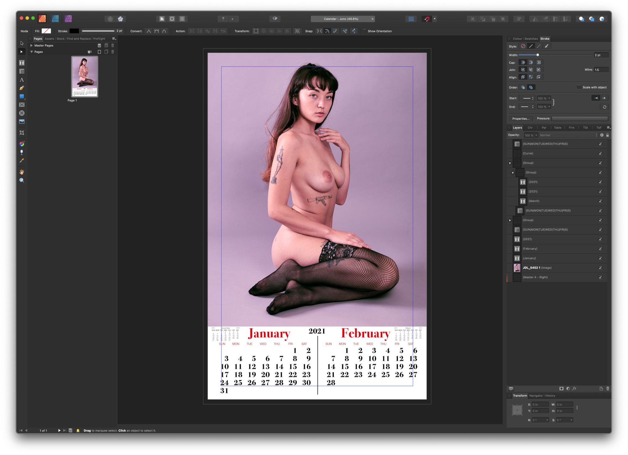
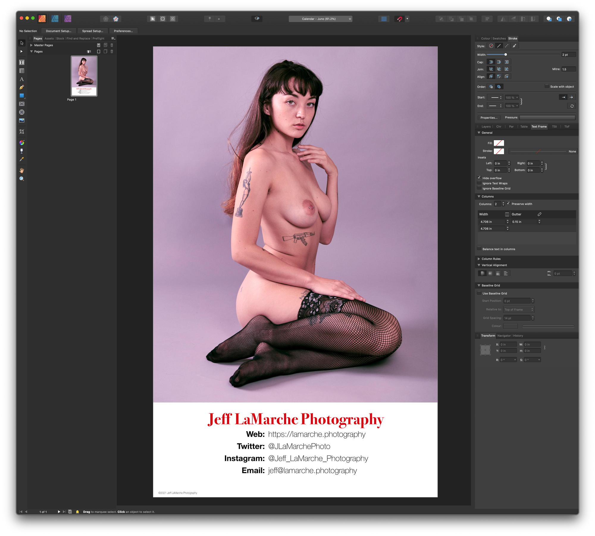
I worked in Affinity Publisher to create my first design prototype. For this first version, there were no tear-off sheets and it was intended to simply show what the final calendar would look like.
Font Choice
For the calendar numbers and month names, I used Bodoni 72, which appears to be what the the Walt’s 505 Club calendar uses. For the rest of the text, I opted for Helvetica Neue. It’s anachronistic, since that font didn’t exist until the early 1980s, but I tried both Helvetica and Helvetica Neue and just thought it looked better with Helvetia Neue. As I said earlier, I’m not trying to exactly replicate those historical calendars.
Layout
The calendars from that era I’ve found come in a few different sizes. The most common size for the tear-off style of calendar seems to be 12″ x 19″, which works out well, because my photo printer maxes out at 13″ x 19″ borderless. That means I can print full page and then just trim a half inch off of each side.
I went with a two month calendar layout and played around with a lot of different design and font options until I landed on this, which feels sufficiently reminiscient of classic pinup calendars for me.
The one common element of the original calendars that I’m missing is the promotional text. I tried a few options, but I just like the simplicity of not having it. I also don’t have anything I really need to promote right now. While I do occasionally take paying gigs, photography is mostly a creative outlet for me and not something I’m trying to make a living off at the moment.
From Prototype to Calendar
Once I was happy with the design, the next step was to actually turn it into a physical calendar with tear-off sheets. I removed the calendar content from my digital prototype, and turned it into the calendar backboard. I replaced the calendar with a little promotional text. This text will never be visible unless somebody rips off the last month, but if they do, they’ll know how to contact me to find out if I’m doing another calendar for next year.
I moved the calendar content to a separate 4″ x 12″ document and then laid out all the months of 2021. I included all US federal holidays (in red), as well as many other major holidays. Space in this format is tight, so I couldn’t include every holiday, but I tried to include the major ones from the major religions. I did boot Columbus Day in favor of Indigeneous Peoples’ Day (they’re the same day), because I only had room for one and, well… fuck Columbus.
Unfortunately, the decision to go with a two-up layout means I can’t print them on normal letter size paper and had to order a ream of legal size paper for the project.
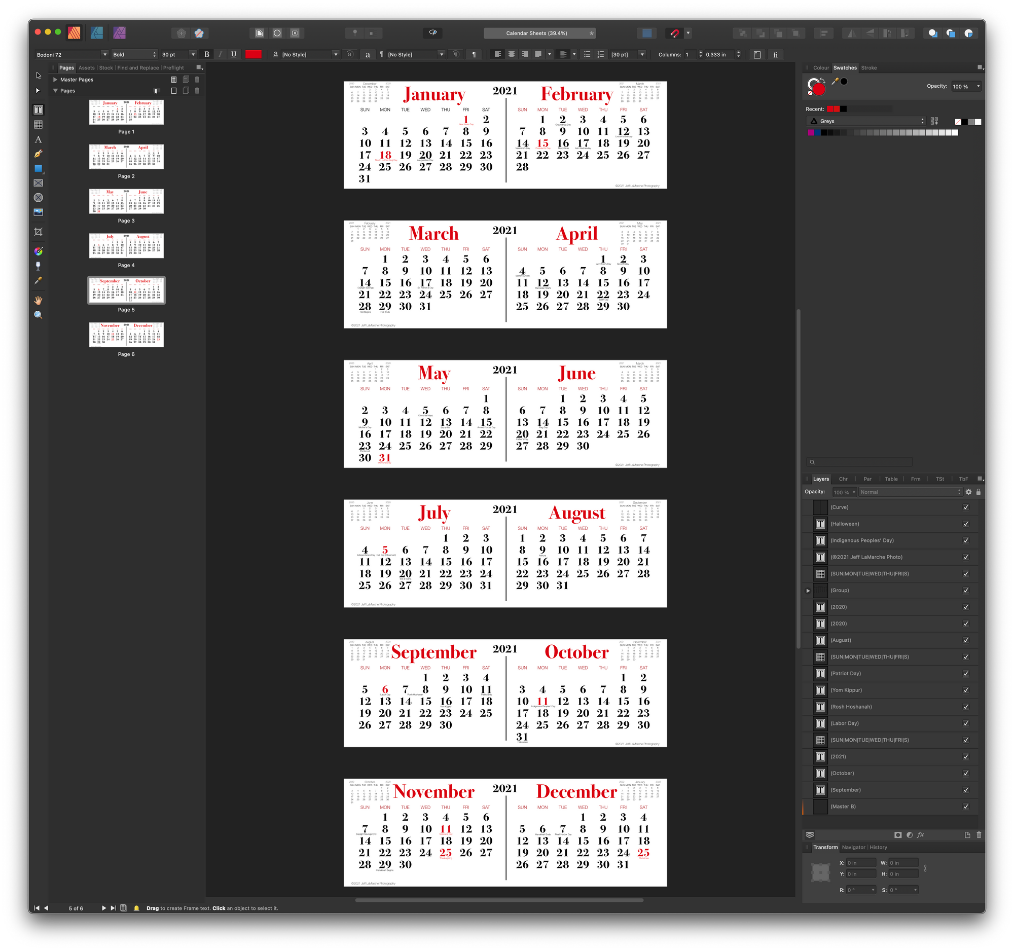
Laying out a calendar is a surprisingly tedious task. 😬
Construction
Once all the digital files were created and proofed, it was time to create the first calender to see if it works. There’s two parts here: the backboard, which I printed on my photo printer, and the calendar sheets, which I printed on my color laser printer.
Printing the Backboard
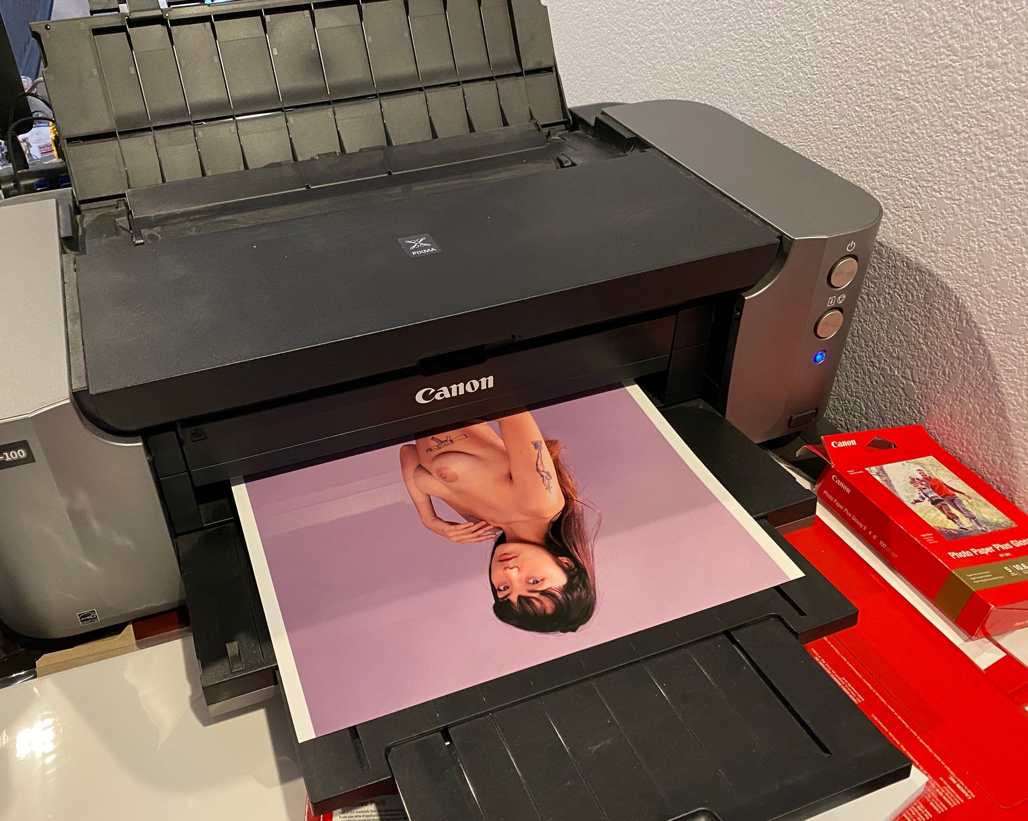
For the first calendar, I went with the best paper stock I had handy: Canon Platinum Pro N (Glossy). This is shinier and higher quality than the historical calendars that inspired the project, but will result in a nice image. I might order a matte or satin paper if I decide to make more, but this works and looks pretty good.
Printing the Calendar Pages
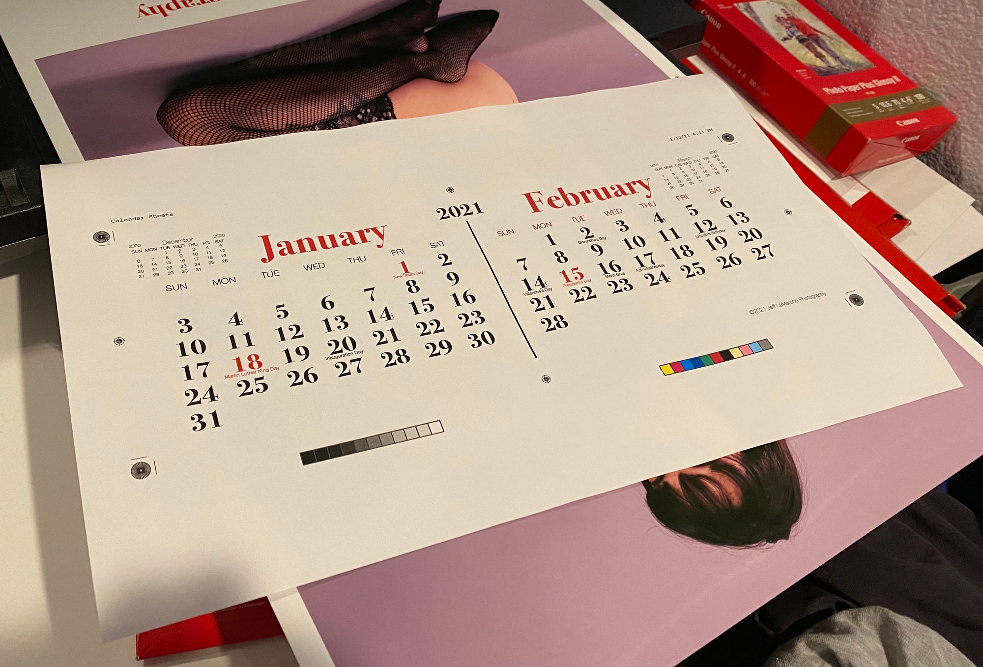
The individual calendar sheets are printed on a premium legal-sized office paper on a color laser printer. There are six pages total (two months per page). These will be cut out and stapled to the backboard to create the calendar.
Trimming the Calendar Pages
Unfortunately, I don’t have a guillotine cutter, so I used the best thing do I have: a Dahl professional heavy duty rotary cutter. It generally worked well, but was tough to be as precise as I needed while keeping the pages together.
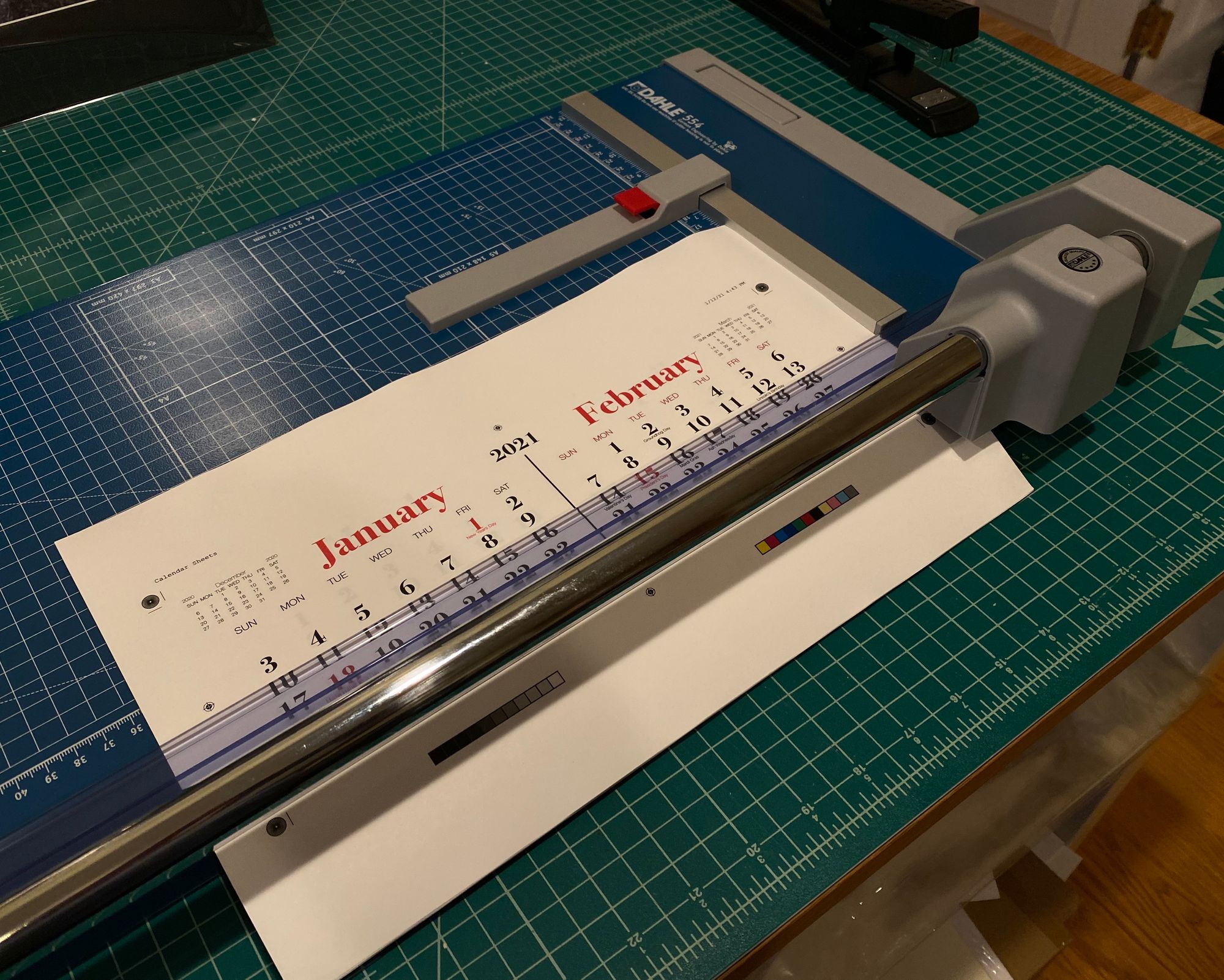
Trimming the Back Board
I also used the Dahl to cut the backer board. That was an easier cut, since I didn’t have to keep multiple sheets together.
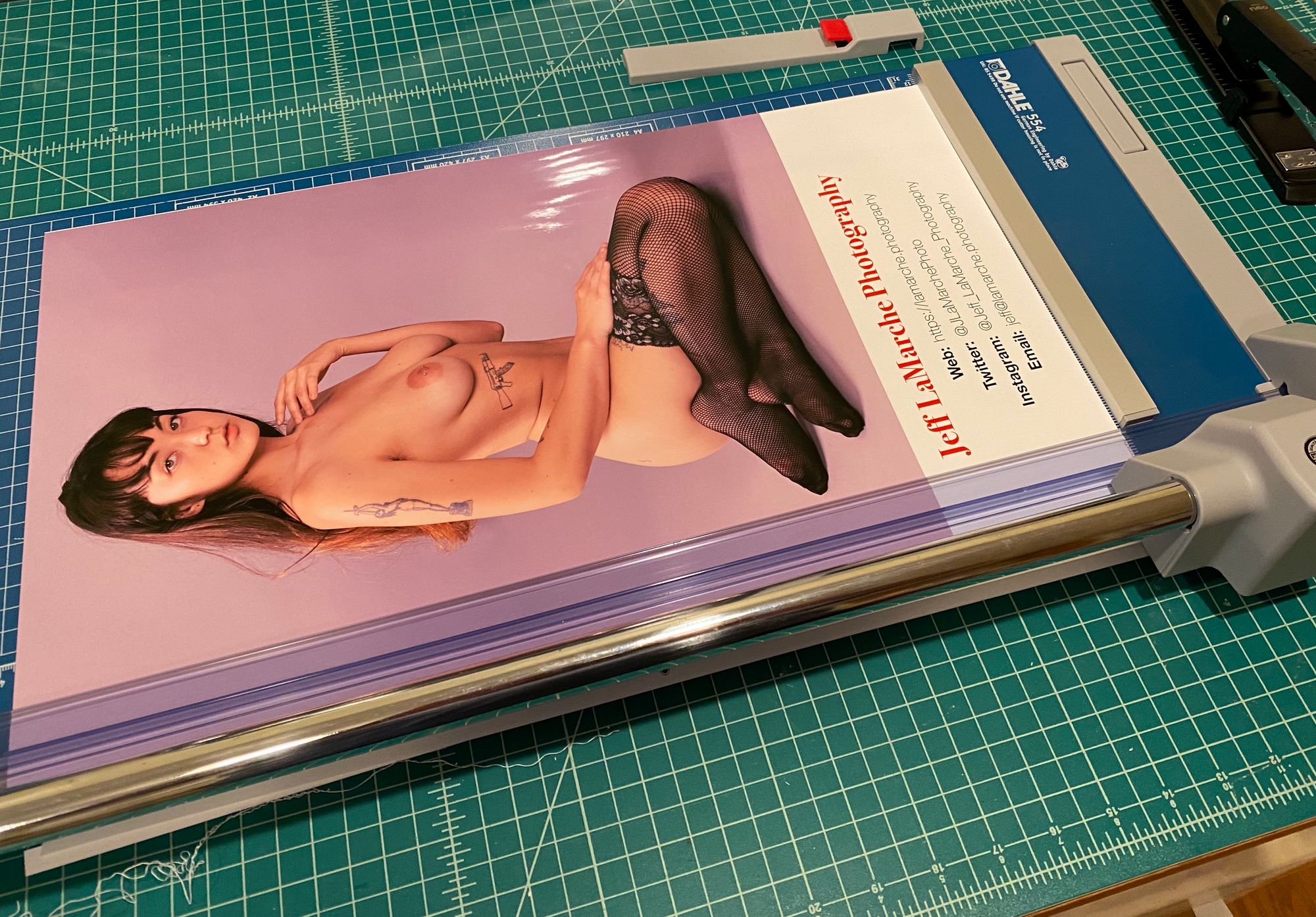
Assembling the Calendar
The final step is stapling the calendar sheets to the backer board. I used a cheap saddle-stich stapler to attach the sheets.
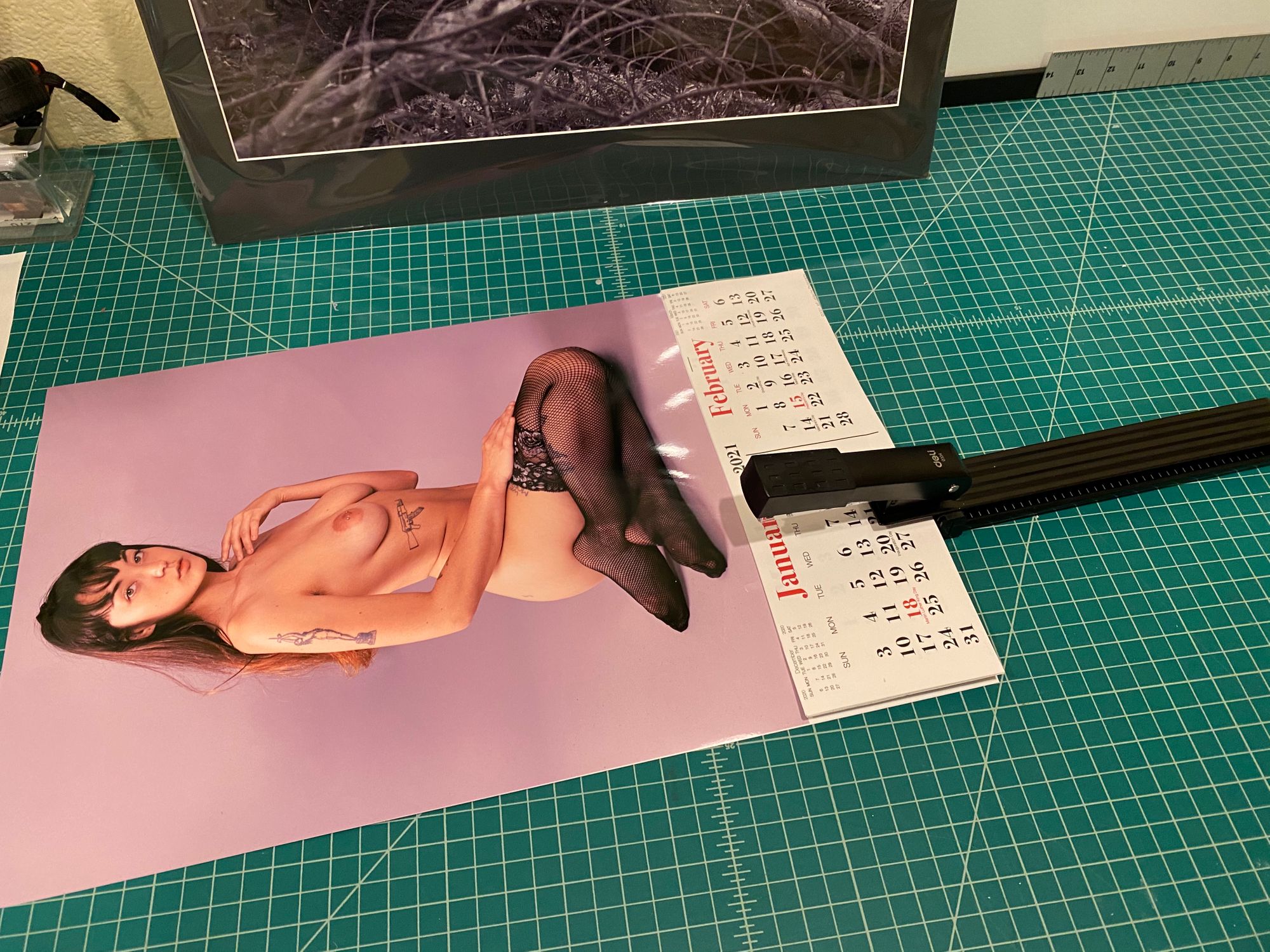
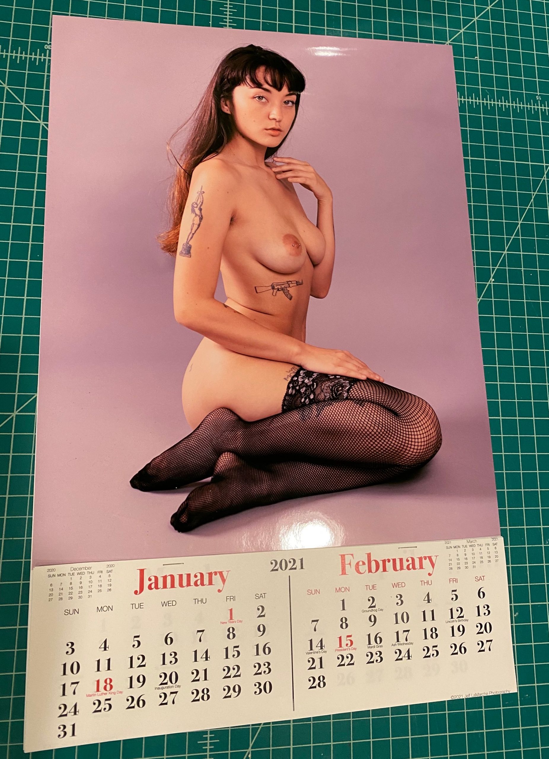
And once assembled, we have our calendar:
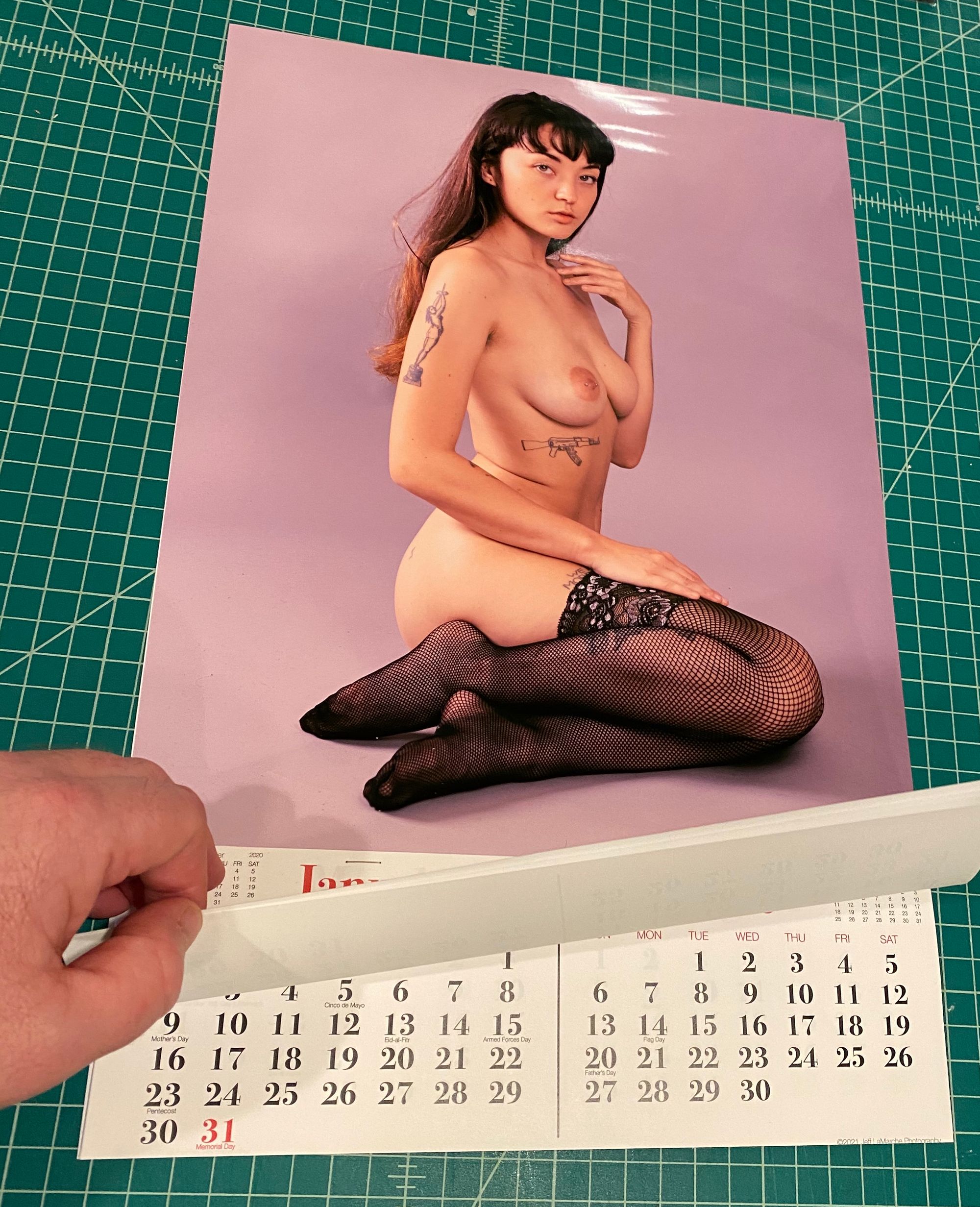
Lessons Learned
With any kind of project like this, the first one you make is going to be imperfect, and this wasn’t an exception. Still, I’m really pleased with how it came out. Although there are some minor issues, I wouldn’t be embarrassed to hang this first one on the wall.
If I decide to make any more, there are a few changes I’ll make. My margins are a bit too small in a few places. The rotary cutter did a nice job, but it’s not as precise as a good guillotine cutter, and I lost a little bit of my margins to the overprint required for borderless printing. Some cutting guides on the calendar printouts will also help during assembly.
All-in-all, though, I’m quite happy with the result!